Case Study: Studdi Buddi

For INF 352 (Prof. Olivier St.-Cyr)

Our team was tasked with discovering a problem and a target demographic for a user-focused design prototype. This case study provides an overhead view of the five projects that guided us through the double-diamond model of UX research, and which led to the creation of our interactive prototype. At the end of this page, you'll see the finished prototype for Studdi Buddi: a mobile application that helps U of T St. George students efficiently determine which study spaces are best suited to their daily needs.

In each section, bold text indicates a new technology or UX research methodology we employed to complete the related project. This case study is meant to be viewed on a full-screen monitor or laptop: if the pink section below takes up the full width of the screen, your window is too small.

About the Project

  • Team: Christina Chan-Ying, Oliver Daniel, Shae-Linn Davies, Yandrickx Dumalag, Reese Halfyard
  • Platform: Mobile application
  • Sector: Student life
  • Tools used: MURAL, Balsamiq, Canva, Google Drive
  • Primary responsibilities: Conducted secondary research; drafted and edited summary text; conducted lean usability evaluations; designed and reviewed screens for medium-fidelity prototype.

Project 1: Discovery
diverging

As our group formed and began preliminary discussions, we realized that all but one of us were new to the St. George campus in some way. Although pandemic-related frustrations entering and exiting Robarts often meant it was simplest to remain inside Bissell to study, we found ourselves wanting a change of scenery. But, we were left with the question so many of our peers, even those with experience on-campus, had asked before us: where should I go? And, even once you know where to go, how can you be sure that you won't run into capacity limits once you get there?

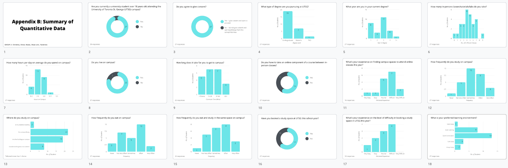
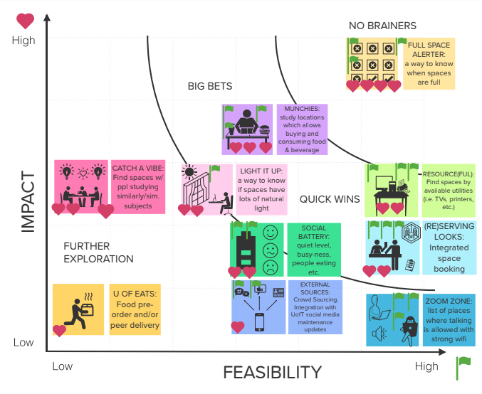
In this project, we conducted preliminary research into our target demographic – UTSG students– and how their studying is affected by their surroundings. We did this by conducting field observations and an anonymous survey focused on personal environmental preferences, both of which which turned out to provide data that was a little too general to extrapolate from. We also conducted secondary research by way of analyzing scholarly texts. The articles we found the most useful discussed the mental models people create when discovering and navigating around new places.

The Navigational Information Matrix (Zhang, 2019) describes how people encode their experiences with a place in three dimensions.
Google Forms survey.

Project 2: Interpretation
converging

With our data in hand, this project set us out on the laborious journey of interpreting it to derive tangible, meaningful conclusions about our target demographic. After making a few notational decisions about how scale-based questions ought to be evaluated numerically, we came out with a full table of respondent data and our expected averages. Our qualitative data, meanwhile, was recorded into a affinity diagram, which we drafted using MURAL to simulate the in-person experience of sticking Post-It notes to a board.

We evaluated our quantitative data from Project 1 by means of charts (above) and central tendency measures – mean, median, and mode.

These averages and trends then became personified in our user persona, Ezra: a third-year undergraduate student with a number of factors preventing him from studying at home. Building a solid model of Ezra's attitudes and behaviour in an Empathy Map, and his current situation in a As-Is Scenario, provided a strong sense of narrative to later projects.

Empathy map for user persona Ezra Maclaren, whom we would refer to throughout the remainder of the semester. His Type 1 diabetes diagnosis provided a sense of urgency to finding a study space that would allow him to eat when his blood sugar was low.

Project 3: Ideation
diverging

This project finally allowed us to get creative and explore the possibilities of what our solution ought to do. Although everyone in the group naturally gravitated toward the idea of a mobile application, we had to keep our minds open and put out any ideas we thought of, even the more absurd ones, in the hopes of finding that perfect 'high impact, high feasibility' combo of the No Brainer. For this reason, keeping Ezra in mind became a priority from this assignment onward.

Ezra's "needs" statements focused our ideas on what was most important for our users.
The Ideation phase was informative for many reasons, but I find it exemplififes the importance of the art of compromise in group work, especially when everyone has to combine their varying opinions into a singular finished assignment or prototype. I was fortunate enough to be working with a team with excellent communication and compassion, so we were able to rapidly come to a compromise on disagreements.

The prioritization grid above helped us prioritize which of our ideas, no matter how zany, would be both the most impactful for our users and the most likely to actually work in practice.

Project 4: Experimentation
converging

After letting our imaginations run wild, it was time to converge all of our ideas into a series of singular prototypes: one low-fi prototype on paper, and one medium-fi version, made interactive using Balsamiq. In order to make sure that our prototypes lined up with our To-Be Scenario and our business outcome hypotheses, we ran an array of lean usability tests with our peers. These involved observing testers as they attempted to accomplish a series of tasks inside the app, ranging from logging in to reporting a maintenance issue they discover inside a library. With the low-fi prototype, this also involved Wizard-of-Oz testing, in which a human served as the computer and guided testers from screen to screen based on verbal and gestural 'input'.

Watching someone else use your product, with limited or no ability to instruct or help them, is a feeling I'm not sure a designer ever gets used to; but, these formative evaluations provided us with some of the most meaningful feedback we had received so far. I placed the low-fi storyboard behind this video of our mid-fi prototype in action, to represent how the prior served as a bedrock foundation for the latter.

Projects 5–6: What have we learned?

In our final two projects, a presentation and the Evolution assignment, I had the chance to look backward at the fruits of our labour, at the end of a semester of unique challenges and struggles. Below, you'll find a summary of my Individual Evaluation, and the grade I gave each of my groupmates:

...Just kidding. In all seriousness, this project was a fascinating and educational foray into UX research and design, as well as in long-term group collaboration. By the final assignment, we were working so efficiently, dividing tasks and taking breaks to review one another's work, that we were able to wrap up in just one two-hour Zoom call.

As we noted in the Evolution assignment proper, the one change we would make if we were given the chance to begin anew, would be to structure our primary data-gathering techniques in the Discovery assignment in a more purposeful way. Especially with the rigours of the Interpretation assignment, having a more focused set of data would have made drawing meaningful conclusions much easier and less labour intensive, rather than requiring a custom Python script to calculate average survey results.

I am interminably grateful to my team, each of whom employed their unique skills and personality to the fullest extent to keep us organized, motivated, and submitting high-quality assignments on time. If you're reading this, thank you!

In either case, I also want to extend a huge thank you to Prof. St.-Cyr, who not only provided ongoing feedback and accommodations when we needed them, but also led us through the entire course project one lecture and studio at a time.